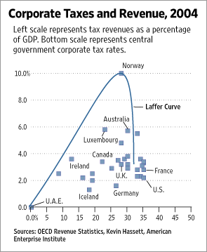
Here's a demolition, if any were needed, of this outrageous graph. Anybody with the slightest comprehension of what a graph with data points and a best-fit line ought to look like can see that it's nonsense, and yet the Wall Street Journal's ever-reliable editorial page used it to try to argue (in brief) that tax cuts pay for themselves (for that sort of thing is the Holy Writ of the WSJ editorial writers).
(Oh, and it turns out that they didn't even put the Norway "outlier" in the right place. It should actually be in the same blob as the rest of the data points.)
The graph reminded me inescapably of...

...that classic of scientific literature, Electron Band Structure In Germanium, My Ass.
The difference, of course, is that the WSJ are ignoring the actual data and just preaching their Laffer Curve gospel, while Lucas Kovar was doing his darndest to make an experiment work when it just bloody wouldn't. He then wrote up his results with, under the circumstances, great tact and restraint.
Allow me to conclude with my own favourite fancy graph.

The data points - universally applicable, I think you'll find - are my own. The decoration was shamelessly scanned from The Visual Display of Quantitative Information, which is a much more entertaining, and beautiful, book than you might at first expect.
For more on silly graphs, see my old piece about thermal goop.
17 July 2007 at 2:24 am
I got lotsa <3 for Edward Tufte.
18 July 2007 at 7:02 pm
i quite like it, hope someone sues them ;)